In recent years, there has been a dramatic rise of unstructured data from different sources such as social media, videos and photos, and businesses are looking for relationships between data which can be viewed from multiple perspectives. This evolution of the way the data is being produced, processed and analysed is bringing drastic changes to the world around us.
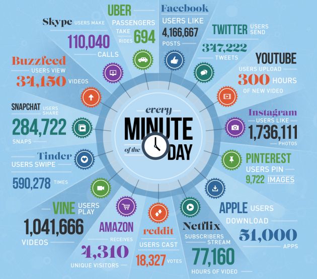
Big data is a term describing large volumes of structured and unstructured data that can be analysed to gain business insights. According to Gartner, big data is a high-volume, high-velocity and high-variety information asset that demands cost-effective innovative forms of information processing for enhanced insight and decision making. In simpler terms, big data is lots of data produced rapidly in many different forms. This rapidly growing data could be related to online videos, customer transactional histories, social media interactions, traffic logs, cell phones, flip computers, tablets, cloud computing, Internet of Things, sensors etc., and global traffic is expected to reach more than 100 trillion gigabytes by 2025. Here is a hint what happens approximately in a minute on the internet, and the generated data continues to grow exponentially:
This huge volume of data needs to be parsed to discover useful threads that can uncover endless opportunities, and can be teamed with innovative ideas to decrease costs, improve overall customer satisfaction, increase revenue, and provide customer tailored offerings. The data requires quick analysis and information must be displayed in a meaningful way. It can be analysed for time reductions, cost reductions, smart decision making, optimizing offerings or new product development.
Big Data focuses on finding hidden trends, threads or patterns that might not be immediately or easily visible. The interpretations bring out insights that would otherwise be impossible to observe using traditional methods. This requires latest technologies and skill set to analyse the flow of information and draw results and conclusions. High powered analytics enable businesses to determine root causes of issues, defects and failures in real time, recalculate complete risk portfolios in just minutes, detect fraud, and so on. NASA, U.S.Government, and organisations like Wal-Mart and Amazon are using Big Data to recognize the possibilities that can help them capitalize the gains.
However, this huge volume of rapidly generating big data cannot be handled using traditional reporting process. To reap maximum benefits, data analytics needs to be done in real time instead of batch processing which fails to capture big data’s immediacy. Another challenge in handling big data is the increased availability of mobile devices. This requires decentralization of reports and adoption of cost-effective, faster and more democratized business intelligence model to improve collaboration and speed insights.
Data Visualization Tools
To make sense of the boring raw data and observe interesting patterns, organisations use visualization tools that help them visualize all their data in minutes. Data Visualization places data in the visual context such as trends, patterns and correlations, which helps organisations understand the significance of the data which may go undetected if this data was just text-based. This beneficial visual matter can help companies eliminate loss making products and increase revenue by minimizing waste. Data visualization can help identify areas that require attention or improvement, help understand product placement, clarify factors influencing customer behaviour and can predict sales volume.
Some of these tools are for developers and require coding, while others contain data visualization software products that do not require coding. Here are some of the commonly used data visualization tools:
1. D3.js (Data Driven Documents) uses CSS, HTML and SVG to render diagrams and charts. The tool is open-source, looks good, is packed with helpful features and is interactivity rich.
2. FusionCharts has an exhaustive collection of maps (965) and charts (90) that work across all platforms and devices, and supports browsers starting from IE6. It supports XML and JSON data formats, and can export charts in JPEG, PNG and PDF. For inspiration, there is a good collection of live demos and business dashboards. Although, the tool is slightly highly priced, it has beautiful interactions and is highly customizable.
3. Chart.js is an open source library that supports bar, line, polar, pie, radar and doughnut chart types. The tool is good for smaller hobby projects.
4. Highcharts offers good range of maps and charts right out of the box. It also offers a different feature rich package called Highstock for stock charts. The tool is free for personal and non-commercial use, and users can export charts in JPG, PNG, PDF and SVG formats.
5. Google Charts can render charts in SVG/HTML5 . It offers cross-browser compatibility and cross-platform portability to Android and iPhones.
6. Datawrapper is commonly used by the non-developers to make interactive charts. The tool is easy to use and can generate effective graphics.
7. Tableau Public is one of the most commonly used visualization tool as it supports variety of maps, graphs, charts and other graphics. The tool is free and can be easily embedded in any webpage.
Raw, Timeline JS, Infogram, plotly, and ChartBlocks are some of the additional data visualization tools. Excel, CVS/JSON, GooGle Chart API, Flot, Raphael, and D3 are some of the entry level tools which are good to quickly explore data or create visualization for internal use.
On the other end of spectrum, there are professional data visualization Pro tools that have expensive subscriptions. There are few free alternatives as well with strong communities and support. Some of these tools include R, Weka, and Gephi.
These data based visualization tools are focussed on the front end of the big data that enable businesses to explore the information and gain deeper understanding by interacting directly with the data. On the other hand, Apache Hadoop is an open source software associated with Big Data to support the back-end concerns such as processing and storage. There are several variants of Hadoop such as MapR, Hortonworks, Cloudera and Amazon. Google BigQuery is a cloud-based service.
Businesses seek most cost-effective ways to increase profitability by managing volume, velocity and variety of the data and turning that data into valuable information to better understand business, customers and marketplace. However, volume, velocity and variety are no longer sufficient to describe the challenges of big data, hence more terms such as variability, veracity, value and visualization have been added that broaden the realm of the big data scope. Big Data is exploding with innovative approach and forward thinking, and organisations can exploit this opportunity to gain market advantage and increase profitability.